Today, I would like to talk about an independent Dutch watchmaker whose work clearly deserves a closer look. If I say artisanal Dutch watchmaker, inverted time display, and a watch that intrigues from the very first glance, the more knowledgeable among you may already have recognised Dijkman Watches and his Versum. Before presenting this piece in more detail, let me first take a step back and look at the man behind the project, his background, how he developed as a watchmaker, and the logic that eventually led him to propose such an unusual reading of time.
With Holke Dijkman, everything starts very early. As is often the case in the most sincere paths, the passion begins first as an almost instinctive form of curiosity. From a young age, he would take apart anything that came into his hands to understand how it worked: an old radio, a clock, an electric alarm clock, a CD player, or any other mechanical or electromechanical object. He grew up in a rural environment, his father having worked as a farmer and cattle breeder for a few years before the family left that world and settled in the centre of the Netherlands. This very concrete relationship to objects, materials and the inner workings of mechanisms seems to have shaped his eye from an early stage. And when you speak with him today, you immediately feel that this curiosity never disappeared. On the contrary, it seems to have remained at the very heart of the way he works.
Holke did not follow a conventional academic path. He first enrolled in a technical school, where he studied metals, manufacturing techniques and machine design. This foundation mattered, because it gave him an early and very practical relationship with machining, fabrication and mechanical precision. He then joined the Dutch watchmaking school, from which he graduated after four years of study. The course followed a progressive logic, moving from clocks to watches: students would begin by working on clock mechanisms before moving on to watches over the years. He regards this training as essential to his development, because it allowed him to confirm his deep interest in horology. It is also important to point out, however, that this school trained students above all in repair, servicing and understanding how watches work, far more than in the creation of original watches or the development of independent watchmaking.
His graduation, however, came at a historically difficult moment for mechanical watchmaking. We are in the aftermath of the quartz crisis, at a time when the arrival of Japanese quartz watches was profoundly disrupting the industry. That context inevitably weighed on the beginning of his career. His first job as a watchmaker actually came to an end in 1985 because of compulsory military service, which was still in force in the Netherlands at the time. But once again, this interruption would end up feeding his path rather than slowing it down. In the army, Holke worked as a technician on optical and mechanical instruments, notably on targeting and sighting systems for tanks and armoured vehicles. His skills in precision mechanics found an unexpected but highly formative field of application there.
He later joined W. Prins Matrijzen and Models in 1992 as a toolmaker. This was an important step, often less highlighted than what came after, but one that allowed him to build a solid background in milling, grinding, polishing, hand finishing and other fundamental techniques. In other words, long before offering his own watches, Holke Dijkman had built an extremely concrete technical foundation at the crossroads of repair, machining, fabrication and precision work.
The major turning point in his career then came with Christiaan van der Klaauw. At first, Holke began helping him one day a week, then two, then three, then four, until eventually working with him full time. This gradual progression matters, because it shows clearly that this was not some brief interlude, but a true immersion in a very specific horological universe. For more than a decade, he worked in direct contact with astronomical complications, planetariums and highly technical pieces. His role was far from secondary: he notably took part in gear train calculations and the creation of prototypes for astronomical watches. This period was absolutely central to his development. Even though he already had a solid repair background, he still lacked the experience needed to design his own timepieces. His work alongside Christiaan van der Klaauw allowed him to grow in movement design, mechanical complexity and the development of highly singular pieces. According to him, each year of working together led to the presentation of a new model at Baselworld, which meant a considerable level of intensity and constant technical demands.
After this long chapter, Holke then spent around three years at Van der Gang Watches in Dokkum. There, in addition to repairs and servicing, he also assembled new watches. This period further deepened his practical experience in a field more directly connected to the wristwatch itself. Even before launching his own watches, Holke had already started creating clocks. He notably made several regulators, such as the “Classic” and the “New York,” as well as a table clock developed with Christiaan van der Klaauw, for which he handled the technical conception, production and finishing. His move into watches should therefore not be seen as a sudden break, but rather as the natural outcome of a path in which clocks, repair, precision mechanics, complications and fabrication constantly fed one another.
It was after these different experiences that he decided to launch his own activity. At first, he quite naturally turned toward clocks, but several factors gradually pushed him toward wristwatches. From an economic point of view, clocks were not necessarily the most favourable field. Their after-sales service and maintenance often required travel, which made the activity more constraining. Above all, he gradually understood that the wristwatch would allow him to express his creativity more freely within a more manageable artisanal framework. He therefore chose to develop his own watches, with the desire to propose something personal, complex and immediately identifiable. Even today, he still responds to certain requests related to clocks, while concentrating an important part of his energy on his watches. His activity remains structured in a very gradual and highly artisanal way, which in the end fits his personality rather well.
It is within this logic that Versum appeared. The name, of Latin origin, literally means “inverted” or “reversed,” which sums up the central idea of the piece perfectly: here, the movement is inverted. This choice is far from anecdotal. It belongs to a broader reflection on how time can be read differently. After spending so many years in the world of astronomical horology, Holke naturally retains an interest in those themes, but he does not feel the need to reproduce that universe directly in his own watches. What interests him more today is proposing a reading of time unusual enough that a collector stops, observes, takes a loupe and genuinely wonders how it works. In other words, less an astronomical demonstration than a horological disturbance, a way of bringing surprise back into the experience.
And that is probably also what comes through when you discover him in his own environment. Holke Dijkman gives the impression of a sincere, humble and passionate watchmaker, with a real coherence between his workshop, his pieces and his philosophy of work. He seems to move forward in his own way, at his own pace, without trying to do too much, but with real standards and a very clear vision of what he wants to offer. Versum is therefore not simply one more watch imagined by an experienced watchmaker. It is the result of a long, technical and deeply artisanal path, nourished by repair, clocks, astronomical complications and a very personal desire to disrupt our usual reading of time. Now, let us move on to the presentation of this watch.
Table of Contents – Dijkman Versum
What are the key features of the Dijkman Versum?
Case
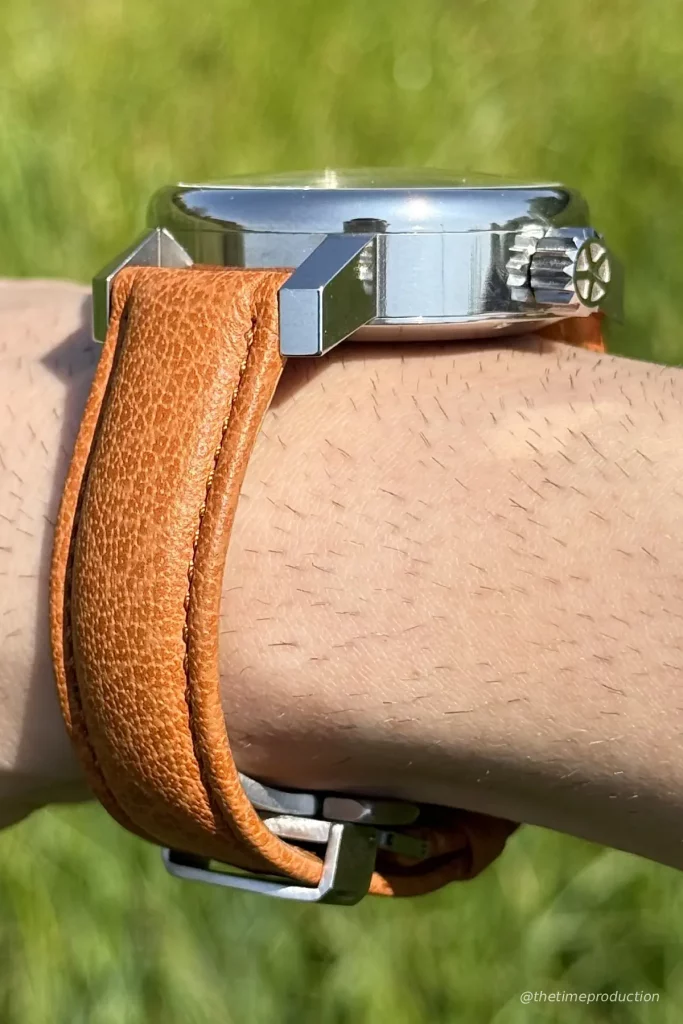
For this Dijkman Versum, Holke Dijkman chose a 42 mm steel case with a thickness of around 13.1 mm. And this needs to be said right away: it is a bold, imposing case that makes absolutely no attempt to disappear on the wrist. That was in fact the first thing that struck me. Visually, the watch has real presence, almost a sort of mechanical ruggedness, and on a slim wrist like mine, you feel it immediately. Between the diameter, the thickness and the fairly long lugs, this is clearly a piece that takes up space. Personally, I did not find it especially comfortable, but that feeling also has to be understood in light of the construction of the watch itself and the technical constraints it carries.
Because this thickness is obviously not there for no reason. It is directly tied to the inverted movement, as well as to the additional gear train required to achieve this very specific display. In that sense, the case is simply the expression of a mechanical logic. And even if that results in a fairly massive watch, I still find it coherent with the overall project. At times, you almost get the impression of looking at a kind of pocket watch transposed onto the wrist, or a horological object whose shape is first dictated by technical necessity before being reworked into a wristwatch. And in the end, that corresponds rather well to what Holke Dijkman himself conveys: something very square, very direct, very sincere in its approach.
What I did like, however, is the very rustic and artisanal character of the case, without it ever feeling poorly finished. On the contrary, the whole thing is polished, clean, solid, and above all it has real personality. You can feel that this is not a case designed by a designer in the traditional sense, but rather by a watchmaker who thinks first and foremost as a constructor. And that is precisely what makes it interesting. There is something raw, functional, almost industrial in this case, and yet it still retains real aesthetic coherence. The custom-made case is composed of three parts, machined from a blank and then reworked in particular through EDM, which also explains the very crisp result in the construction.
The tooling marks, invisible under normal conditions but present if you look closely, also contribute to that impression. Some collectors may see them as imperfections. Others will instead see them as reinforcing the artisanal charm of the piece. Personally, I think it fits rather well with the spirit of the Versum. This is not a watch chasing clinical perfection or an overly designed result. It is a very constructed object, slightly raw in its presence, but deeply coherent with what it is trying to say.
The crown also deserves a special mention. Fairly large, with a design that evokes a gear wheel, it is perfectly in line with the rest of the case. More importantly, it is not only aesthetic. It offers excellent grip, which is always welcome, and I also liked the little sound it makes when winding, which reinforces that very tangible mechanical feel. It is a detail, but an important one on a watch of this kind. Holke also offers two case variations on this 42 mm base, one with straighter lugs in an almost soldered-lug spirit, the other with a more rounded form that extends the case middle differently. That also shows that beyond its apparent ruggedness, the project remains nuanced in its execution.
In the end, this case feels entirely coherent with the overall identity of the watch and the project. It is not the most comfortable case nor the easiest one to wear, especially on a small wrist, and I think it is important to say that plainly. But it is also not a case designed to please everyone. It expresses a logic, a construction, a very artisanal and very personal way of making. And even if it is not the kind of watch I would naturally enjoy wearing, I still think the whole has real strength and real sincerity.
Dial
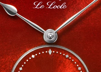
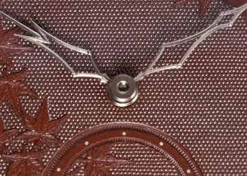
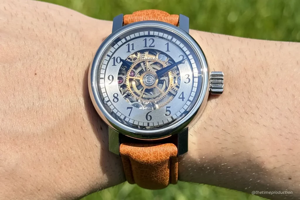
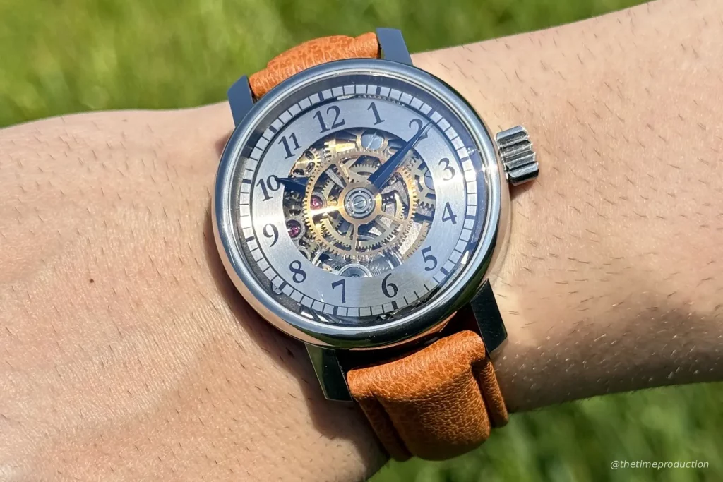
The dial, or more precisely the way Holke Dijkman conceived the display of this Versum, is without doubt the most distinctive element of the watch. And very frankly, it is also what intrigued me the most at first glance. Because here, everything seems almost to float. There is indeed a dial construction, but it does not present itself in any conventional way. First, a peripheral chapter ring that almost appears suspended, then a kind of circular plate hollowed out at its centre, reduced to a ring carrying the hours, and finally, in the middle, a completely unobstructed view of the inverted movement. So within the first few seconds, you are already facing something unusual, where the eye instinctively tries to understand how all of this works.
And that is precisely where the real strength of the watch lies in my view. The hands literally appear to levitate. That is the detail that immediately caught my attention. You can look at the piece, study its construction, try to understand the logic of the display, and yet something almost unsettling remains in this way of making the time indications appear suspended in mid-air. Holke Dijkman has in fact built the entire horological identity of the Versum around this idea. It is the core of his language: to propose a display in which the hands seem to be carried by the wheels themselves, without you immediately understanding what guides them or how the whole thing is mechanically articulated. And honestly, it is extremely successful.
What works particularly well here is also the way this construction remains legible despite its originality. Personally, I found that the use of Arabic numerals brought something more modern and more direct to the watch. Roman numerals would probably have reinforced a more classical, more clock-like or more antique feel, but here the numbers give the whole a slightly more contemporary tone, a little more accessible in the reading. In any case, that is the version I prefer, precisely because it balances the technical side and the visual modernity of the project so well. The typography also contributes to that feeling. It is not ordinary, but neither does it fall into an excess of classicism. It has real personality, which further strengthens the identity of the piece.
I also liked the way the different levels of the dial overlap. You really get the impression that each element is placed on a distinct plane. First this minute ring that seems to float, then the hour ring, then the hands themselves, before the eye drops visually into the movement. All of that creates a very airy, very open, almost weightless effect that works especially well with the very idea of an inverted movement. And it also gives real depth to the watch, without the need to add unnecessary decorative tricks.
The finishes also play a role in this balance. I found it interesting that the chapter rings were given a circular brushed finish, because that brings visual coherence to the whole and intelligently counterbalances the highly polished character of the case. So this is not merely a spectacular display, but a construction that has truly been thought through as a whole. Even the blue lacquered hands, with their small irregularities, retain that living artisanal side that I appreciate a great deal. Nothing feels completely frozen or overly smoothed out, and that gives the watch charm rather than taking anything away from it.
In the end, this dial brings something genuinely unique to the horological landscape in my opinion. It is not just one more original display designed to attract attention. It is the very reason the watch exists. The Versum was created to propose this reading of time, this staging of the movement, this impression of mechanical levitation. And that is precisely why I find the dial so strong: it is distinctive, it remains legible, it immediately intrigues, and it gives the watch an identity that is impossible to confuse with anything else.
Movement
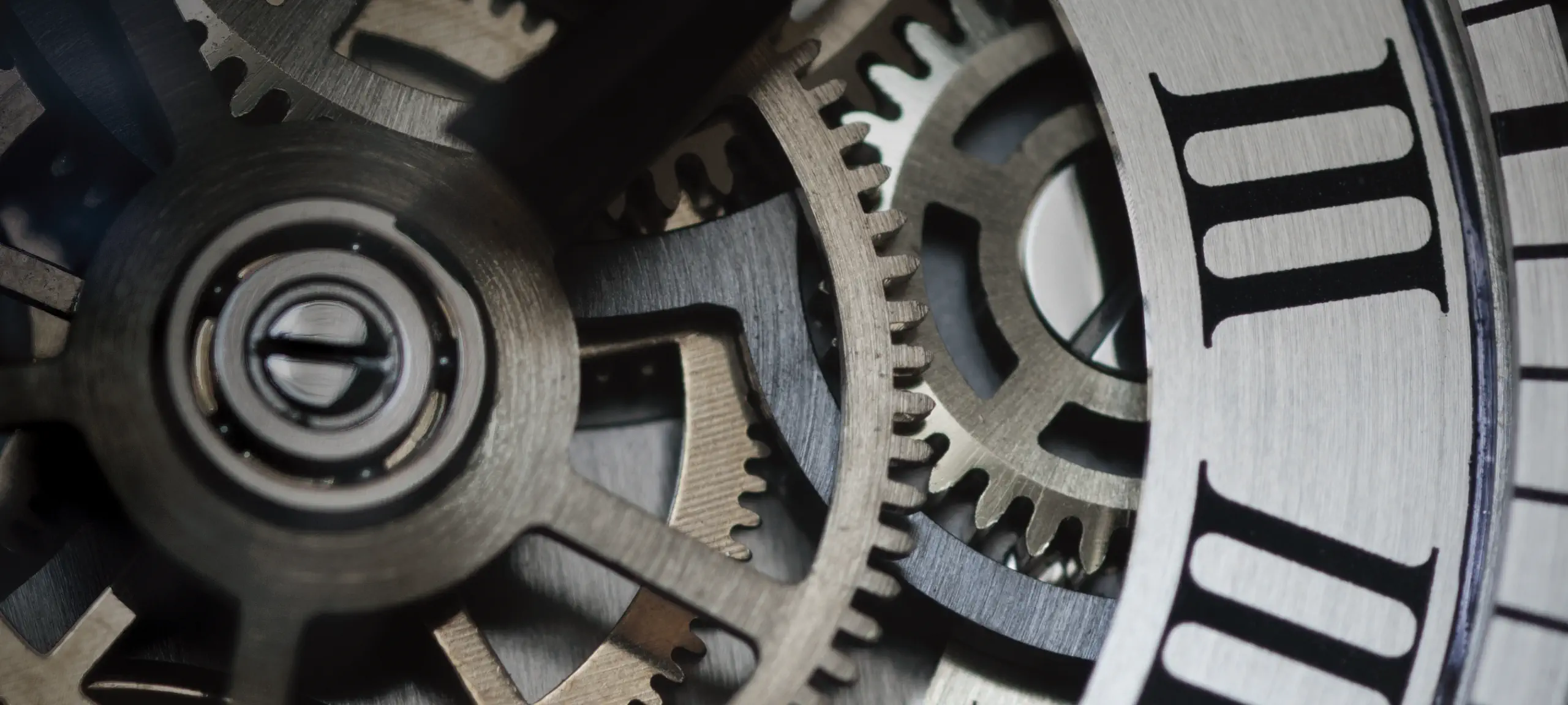
At the heart of this Dijkman Versum, one finds a movement that adds real value to the watch in my view. And even more than that, it almost constitutes its central point. Because the whole appeal of the Versum rests precisely on this idea of turning the movement over, reorganising it, and then creating an entire transmission system that allows the time to be displayed in the correct direction despite that inversion. So this is much more than a simple reliable base cleverly adapted. It is a coherent horological transformation designed to serve a very particular idea of time display.
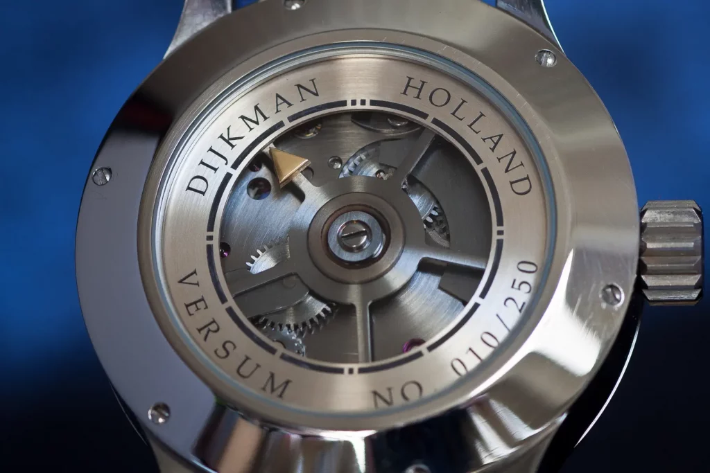
Holke Dijkman started from a hand-wound ETA/Unitas 6497, a widely proven calibre known for its reliability, robustness and ease of servicing. And I find that choice perfectly relevant. It anchors the watch in something durable, repairable and realistic over time, while giving the watchmaker a sound base on which to develop his own architecture. From there, Holke deeply modified the movement in order to invert it and adapt the display of the hours and minutes. He notably integrated 14 hand-made wheels, of which 4 replace original components and 10 serve to reroute the display. That, to my eyes, is what a serious collector should retain first: this is not merely a decorated or reconditioned Unitas, but a reliable Swiss base used as the foundation for something genuinely singular.
What I found especially interesting is precisely this impression of almost dealing with a small clock rather than a wristwatch. The visible wheels, the logic of the transmission, the immediate understanding that there is a true rerouting mechanism behind the display, all of that gives the Versum a very specific presence. You really get the sense of a horological object conceived by someone who also comes from the world of clocks, visible mechanics and concrete construction. And that adds a great deal of personality to the piece.
On the back, one also discovers a second indication of the time, itself carried by a large toothed wheel. It is not a second time zone, but rather a repetition of the current time, almost like a small technical and aesthetic wink designed to enrich the view from the back. Of course, in practice, one will almost never use it as a useful second display, but I still find this detail very interesting. It shows that Holke wanted to extend his logic to the other side of the watch as well, without letting that side become merely passive or secondary.
Visually, the movement is, in my opinion, very coherent with the rest of the watch. It is not trying to compete with the standards of demonstrative high horology finishing, and that needs to be said clearly. You do not have large mirrored bevels everywhere, nor systematically highly polished wheels, nor an execution designed purely to seduce through decorative refinement. But I do not consider that a flaw in the context of this piece. First, because it would have made the price rise considerably. Second, because the language of this watch lies elsewhere. This is a very mechanical, very constructed, very artisanal watch that embraces a certain sincerity in the way it presents itself. And within that register, I find the movement genuinely successful.
I also liked certain more discreet details, such as the gilded and rhodium-plated treatments on some components, which add depth to the whole, or the presence of the jewels, which stand out particularly well and rhythm the construction visually. They are small details, but they contribute to the overall charm of the movement. The power reserve, for its part, remains measured but coherent, with 47 hours recorded in practice, for a frequency of 3 Hz. Once again, this is something reasonable, reliable and perfectly in tune with the overall spirit of the project.
In the end, I think this movement completes the Versum perfectly. It gives the watch real technical substance, gives full meaning to the display, and reinforces the feeling that one is dealing with a singular horological object conceived with coherence. It may not be the most spectacular movement in terms of finishing, but that is not what is being asked of it here. What is being asked of it is to be intelligent, intriguing, reliable and faithful to the spirit of the project. And to my eyes, it fully fulfils that role.
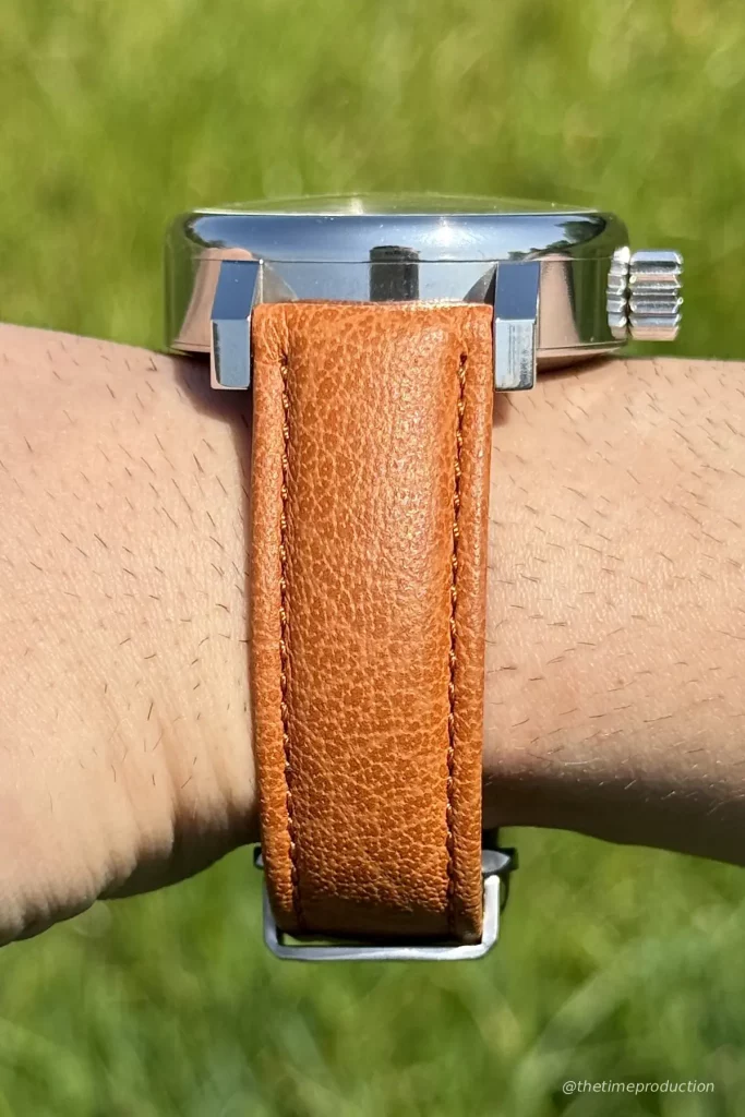
Strap
The strap of this Dijkman Versum is, in my view, clearly one of the weak points of the watch. And I prefer to say that openly, because the gap with the rest of the project felt rather obvious to me. We are dealing here with a padded leather strap that, on paper, might suggest something comfortable and coherent with the rather imposing presence of the case. But in reality, I did not find it convincing at all. First, because the watch itself already has real mass on the wrist, and the strap, rather than compensating for that, actually reinforces the feeling of discomfort.
The main problem, to my mind, came above all from the steel deployant clasp fitted to the example I saw. I found it frankly uncomfortable, to the point that it genuinely harmed the experience of wearing the watch. And since the case is already quite bulky, that does not help. Beyond that question of comfort, I also felt that the strap quite clearly lacked perceived quality compared with the overall level of the piece. Where the case, dial and movement all project a genuine artisanal and mechanical coherence, the strap gave more of a cheap impression, less accomplished and less in tune with the rest.
That does not mean there is absolutely nothing to save in this part. The fact that the clasp is signed, for example, remains a detail I appreciated. I always prefer that to a completely generic and anonymous clasp. But here, that is not enough to compensate for the overall impression, which remains clearly below the standard set by the rest. The padding itself did not convince me much either. Rather than bringing a real sense of quality or additional comfort, it seemed instead to reinforce that impression of a strap that felt somewhat unrefined in its execution.
The good news, however, is that this issue already seems to have been identified. Holke Dijkman recently found a new strap partner in Belgium, which strikes me as a very good thing. And above all, each client can now choose the strap they want, which further reinforces the personalised nature of the buying experience. To my eyes, that is clearly a welcome development. First, because the previous strap did not do justice to the watch. Second, because a piece this particular deserves to be paired with a strap truly worthy of it, both in comfort and in aesthetic coherence.
In the end, I would say that the strap supplied on this Versum was not at all at the level of the rest of the watch, but that this point can fortunately be corrected quite easily. And in the end, that is probably what should be retained here: not an irremediable flaw, but rather an identified weakness, one that the new partner and the possibility of personalisation should allow Holke to address in an intelligent way.
What is the price of the Dijkman Versum?
The Dijkman Versum is currently announced at €9,950 including VAT. I also found in several sources an older price displayed at €5,750 excluding taxes, which suggests that this was probably an earlier price or a positioning that evolved over time. As things stand, €9,950 including VAT seems to me the fairest price to retain today.
To my eyes, this positioning remains coherent with the overall proposition of the watch. Of course, if one were to focus only on the Unitas 6497 base, some might find the price ambitious. But that would be missing the point. Because here, one is not simply paying for a well-known mechanical base. One is paying for a real transformation, a very artisanal construction, a low production volume, a genuine share of hand-made work, and a deeply personal approach. And once the Versum is placed back in that context, the price feels fairly logical to me.
What also seems important to underline is the way Holke Dijkman thinks about his production. The Versum is officially limited to 250 pieces, but this limitation was not conceived within the usual marketing logic of artificial rarity. On the contrary, his explanation is much simpler, and almost touching in its sincerity: at his current pace, by the time he reaches 250 watches, he will probably be at an age where he can retire. It is a very human way of approaching the notion of a limited series, far removed from the usual industry discourse. And that logic makes even more sense when you know that he produces only between 3 and 6 pieces per year, while trying to manufacture as many components as possible himself.
This low production rhythm also allows him to offer real flexibility to the client. Each collector can notably choose small details and their number within the series, which reinforces the intimate and personalised nature of the purchase. Once again, you feel that the project remains on a human scale, with a fairly direct relationship between the watchmaker, the object and its future owner.
Finally, a word should also be said about the packaging, which fits perfectly within this spirit. The watch is presented in a wooden box made artisanally by a craftsman in Poland. The result is very coherent with the overall project: simple, artisanal, sincere, almost rustic in the best sense of the term. A rather amusing little anecdote is that the box creaks slightly, which almost reinforces even further the feeling of dealing with a non-standardised, hand-made object with its own small singularities. And in the end, that corresponds rather well to the overall experience Holke Dijkman proposes with the Versum.
Dijkman Versum: a sincere proposition that fully embraces its singularity
With this Versum, Holke Dijkman offers, in my view, a deeply sincere project, one that is very coherent in its approach, and that is probably what struck me the most. It is not necessarily a watch that suits me personally as a wearer. I found it too large, too thick, and not sufficiently resolved in the case design for what I usually like. It is clearly not a designer’s watch. But in the end, that is precisely where the project becomes interesting. Because independent watchmaking is not only about presenting pieces that appeal to the greatest number of people or that align with one’s own personal tastes. It is also about bringing singular, coherent objects into the light, objects that can resonate with the right collectors for very good reasons. And from that point of view, the Versum fully deserves its place.
What I particularly appreciated here is that beyond the aesthetics, there is a real idea, a real purpose behind the project. One could of course ask what the point is of inverting a movement and then creating a system to display the time correctly once again. But in my view, that would completely miss the point. A large part of watchmaking consists precisely in asking the question: is it possible? And behind that question lies creativity, research, and the pleasure of building a mechanism that intrigues, tells a story and provokes a reaction. That is exactly what Holke Dijkman is doing here. He is not trying to make a purely rational watch. He is trying to propose a reading of time that surprises, that encourages you to observe, to look more closely, and to try to understand.
His greatest strength, to my mind, lies precisely in this way of taking his time and doing things at his own pace, without locking himself into a logic of volume, growth or commercial pressure. He is not trying to produce a large number of watches each year, nor to accelerate his development artificially. And I find that very healthy. The fact that he keeps another activity alongside this one also gives him a certain form of freedom. He can take the time to speak with his clients, remain attentive, follow the first watches that have been delivered, and gather feedback on precision, quality or reliability. I could even feel that in the way the watch was lent to me. There was no pressure, no urgency. He simply wanted the piece to be understood, observed, appreciated for what it is and for the idea it defends. And I find that precious.
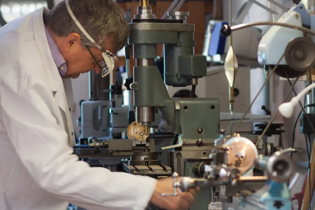
E-visiting his workshop also left a strong impression on me. You find there what you already sense in his watches: a small, coherent world, serious, orderly and deeply artisanal. Workbenches, a lathe, a milling machine, polishing tools, a rhodium-plating bath, custom holders, components in the process of being made. You feel that Holke does almost everything himself, with his own hands, at his own pace, without trying to project a smoother or more sophisticated image than reality. Even the small imperfections, the tooling marks or the more rustic aspects take on meaning here. They are not flaws to be hidden, but almost the signature of a watchmaker who has built his project with his own means, his own logic and his own language.
Do I believe in the trajectory of the project going forward? Yes, but precisely because it does not need to become anything other than what it is. I do not have the impression that Holke Dijkman is trying to turn this into a large-scale activity, nor that he wants to increase production significantly. On the contrary, he seems very clear about the fact that he wants to continue making his watches on a small scale, until he reaches the 250 pieces he has set for himself, and then probably stop. And in the end, I find that very fair. Not every project is meant to become bigger, more visible or more structured. Some are simply meant to exist at the right scale, to reach the right people, and then leave a trace. That is exactly the impression Dijkman gives me.
The future opening around Femina, a smaller watch aimed at a different clientele, also strikes me as interesting to follow. Not because it would mark any spectacular expansion, but because it shows that the project keeps moving forward, at its own pace and with coherence. And in the end, that may be what makes Holke Dijkman’s work so appealing. He is not trying to attract every spotlight. He is not trying to please everyone. He does his work, in his own corner, with seriousness, with logic, and with a real fidelity to his own way of doing things. And I think that deserves to be brought into the light.
I was therefore genuinely happy to be able to present a project like this one. Because it seems important to me as well to talk about those watchmakers who have often worked in the shadows, who have contributed to their national watchmaking scene, and who continue today to produce sincere, personal and singular pieces without unnecessary noise around them. The Versum will probably not be a watch for everyone. But it was never meant to be. And that is precisely why it exists with so much coherence.
And what do you think of this Dijkman Versum and, more broadly, of this kind of independent watchmaking, highly artisanal and highly confidential, that gives priority to ideas, sincerity and coherence over any logic of volume?
Dijkman Versum – Watch Specifications
- Brand: Dijkman
- Model: Versum
- Case Material: 316L Stainless Steel
- Dial: Openworked
- Functions: Hours, Minutes
- Movement: ETA/Unitas 6497, Maually-Wound, 21’600vph frequency (3Hz)
- Power Reserve: 47 Hours
- Water Resistance: 3 ATM
- Crystal: Sapphire
- Case Back: Sapphire
- Case Dimension: 42mm (Diameter) × 13.1mm
- Strap: Brown Calf with Stainless Steel Deployant Buckle
- Availability : Limited production of 6 pieces per year
- Retail Price: € 9,950 TTC
What do you think of this Dijkman Versum and, more broadly, of this kind of independent watchmaking, highly artisanal and highly confidential, that gives priority to ideas, sincerity and coherence over any logic of volume?
If this article added value or sparked a discovery, you can support the project HERE. Your contribution helps me keep weekly articles and a biweekly newsletter free, accessible, and independent for everyone.
For more information about Dijkman, click here.